希瑟·詹姆斯·杰克逊位于怀俄明州杰克逊霍尔的野生美景中,以国家公园为背景,十多年来为西部山脉带来了最高水平的艺术品和服务。
希瑟·詹姆斯(Heather James)迎合独特的社区,使杰克逊霍尔成为美国文化和户外无与伦比的目的地,致力于为当地人和游客提供无与伦比的艺术品和白手套服务。
172中心街,套房101
邮政信箱3580
杰克逊霍尔, WY 83001
(307) 200-6090
开放时间2025 年 12 月 1 日至 2026 年 3 月 28 日
星期二至星期六 上午 10 时至下午 5 时
展览
图稿

安德鲁·怀斯

理查德·塞拉

安迪·沃霍尔

亚历山大·卡尔德

亚历山大·卡尔德

亚历山大·卡尔德

亚历山大·卡尔德

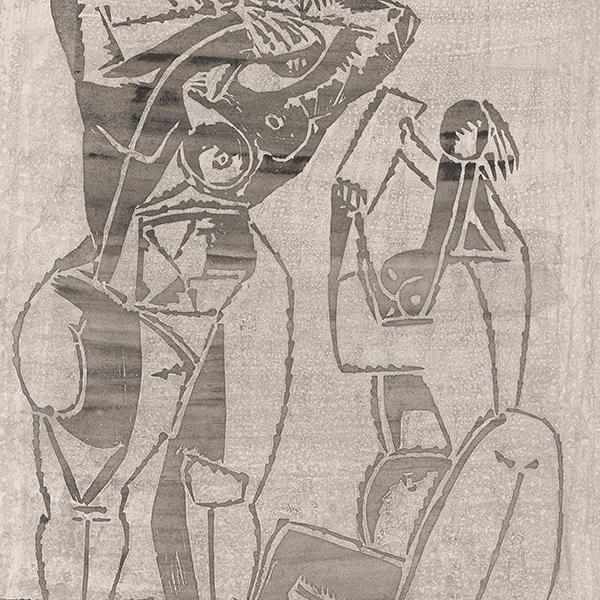
哈里·贝托亚
_tn47464.jpg "HARRY BERTOIA-Untitled (Sounding Sculpture)")
哈里·贝托亚
_tn46213.jpg "HARRY BERTOIA-Untitled (Sounding Sculpture)")
哈里·贝托亚

玛丽·科罗斯

安迪·沃霍尔

雷-帕克

罗素·扬

东南亚

韦恩·蒂博
_tn48022.jpg "RUSSELL YOUNG-Mick Jagger (Sympathy for the Devil)")
罗素·扬
_tn47869.jpg "ELLSWORTH KELLY-Untitled, (from portfolio Eight by Eight to celebrate the Temporary Contemporary)")
埃尔斯沃思·凯利

亚历克斯·卡茨

罗素·扬

埃尔斯沃思·凯利

罗素·扬

罗素·扬

罗素·扬
_tn47873.jpg "ELLSWORTH KELLY-Red Curve (Black State)")
埃尔斯沃思·凯利

约塞夫·阿尔伯斯

约塞夫·阿尔伯斯

拉森·席勒
顾问

ANDREA RICO DAHLIN
高级副总裁
怀俄明州杰克逊霍尔
Andrea 拥有纽约宾汉姆顿大学艺术史学士学位,辅修美术,并在纽约佳士得教育集团获得现代艺术、鉴赏和艺术市场史硕士学位。她曾在堪萨斯城奈尔森-阿特金斯艺术博物馆(Nelson-Atkins Museum of Art)和纽约佳士得拍卖行工作,积累了丰富的博物馆和拍卖行工作经验。
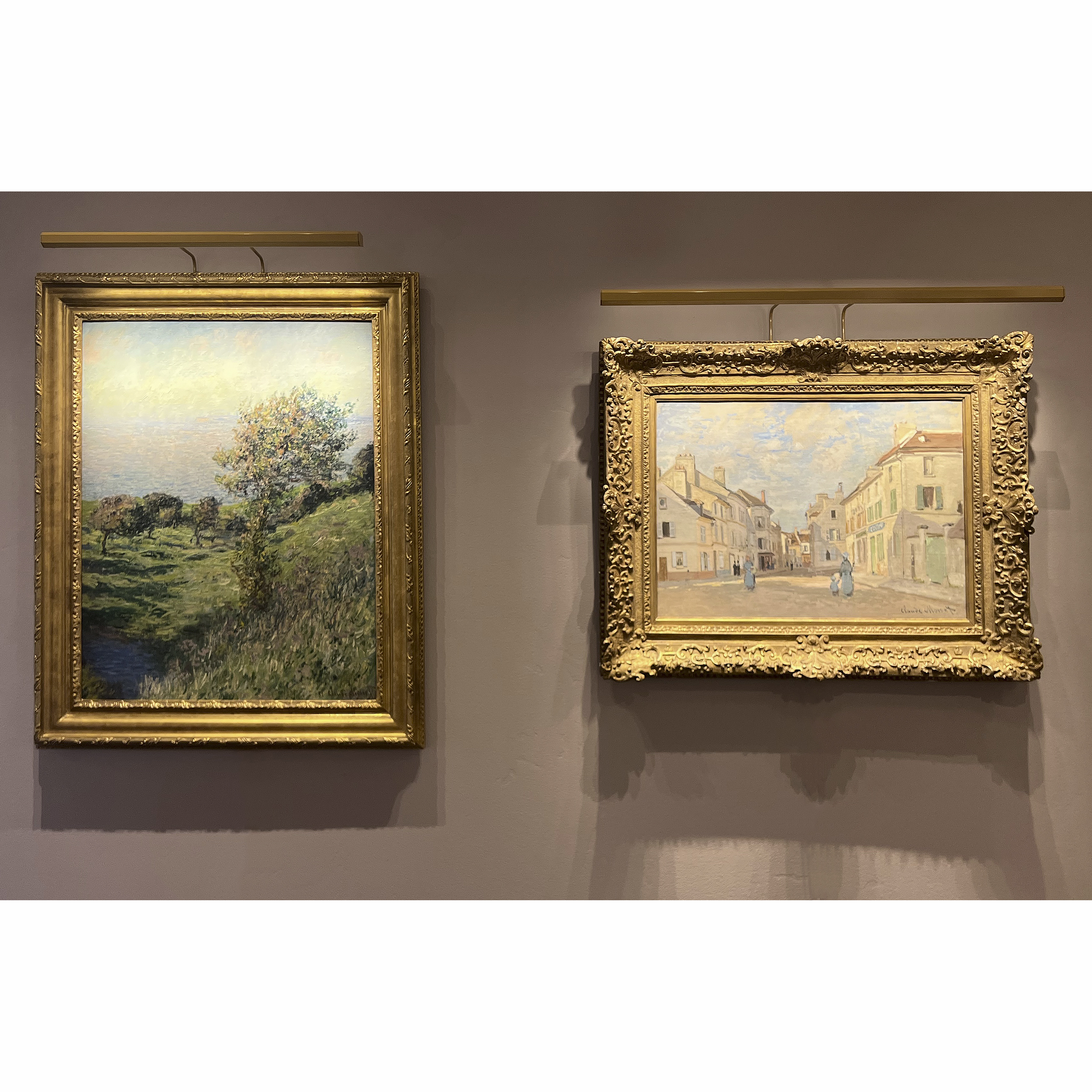
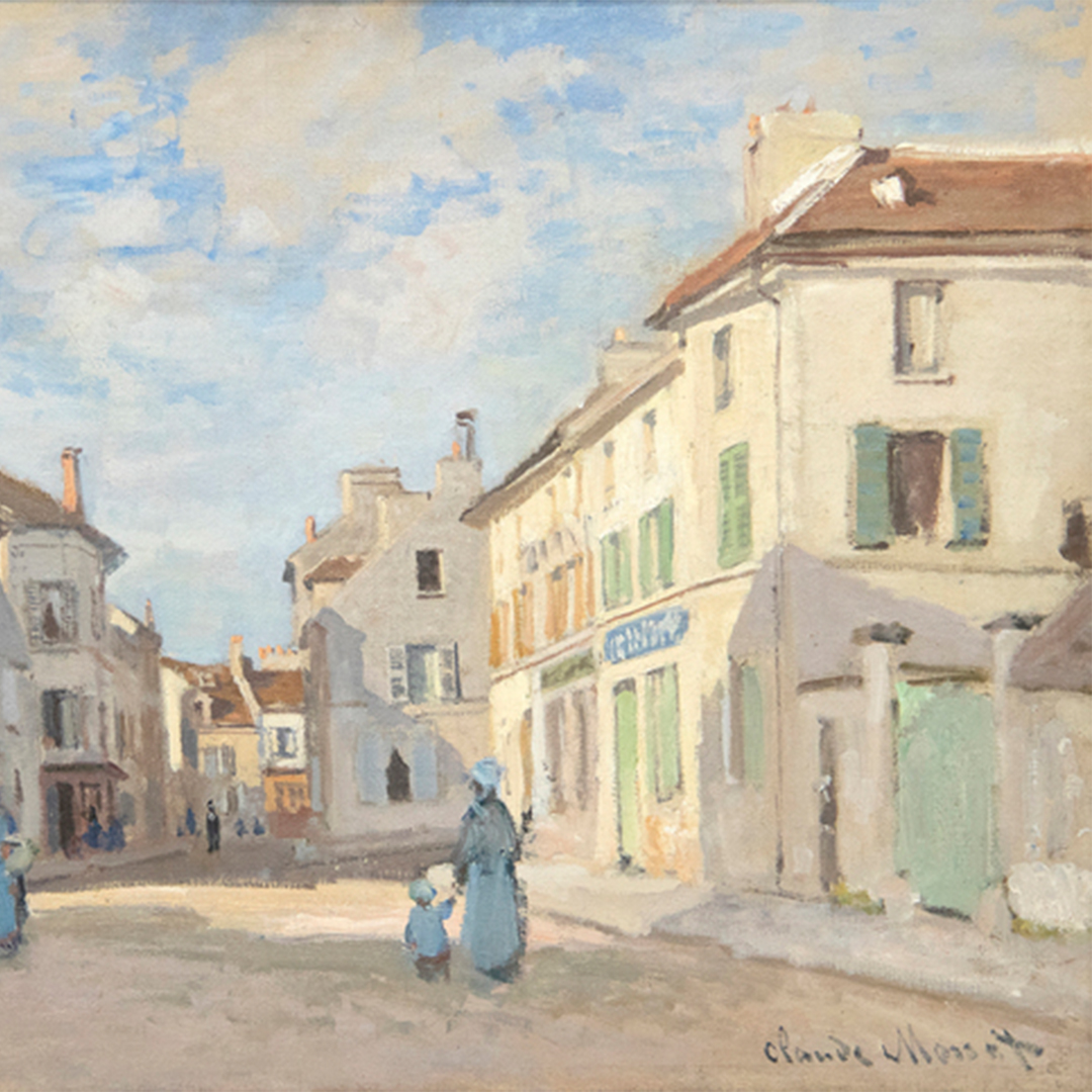
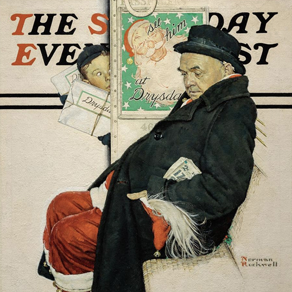
自2015年加入希瑟-詹姆斯美术公司以来,安德烈亚已经获得了寄售,并帮助重要艺术家建立了引人注目的私人和博物馆收藏,其中包括克劳德-莫奈、阿尔弗雷德-西斯利、亨利-马蒂斯、埃德加-德加、诺曼-洛克威尔、安德鲁-怀斯、伊莱恩-德库宁、安迪-沃霍尔和汤姆-韦塞尔曼。

萨拉-菲舍尔
高级副主席 Heather James 和艺术顾问联合主席
怀俄明州杰克逊霍尔
莎拉从小在艺术的熏陶下长大,对艺术和历史都有着深厚的感情。十多年来,她凭借对艺术的热爱,在画廊、拍卖行和博物馆中游刃有余。
莎拉坚信学习和体验业务的方方面面,她在艺术界担任过各种职务,为咨询和工作带来了全面的方法。自 2015 年以来,莎拉一直是 Heather James Fine Art 的关键人物,她为客户提供顶级服务,管理杰克逊霍尔画廊,策划画廊展览和收藏家之家,并带头开展战略推广活动。
莎拉在纽约大学获得了新闻学和艺术史学位,之后又在伦敦佳士得艺术、法律和商业项目中获得了硕士学位,为她的学术生涯打下了坚实的基础。除了在专业和教育方面的追求,萨拉还积极参与自己身边的事业,包括美国大屠杀纪念博物馆,以及杰克逊霍尔公共艺术和泰顿适应性的董事会成员。
作为联席主席,Sarah 将她在艺术和收藏方面的个人经验和知识融入到每一次互动中,始终为客户的需求寻求最佳解决方案。
在新闻中
视频

希瑟-詹姆斯-杰克逊霍尔 - 2025 年夏季与莎拉-菲舍尔合作的艺术作品选集
视频

希瑟-詹姆斯-杰克逊霍尔--与安德烈娅-里科-达赫林合作的 2025 年夏季艺术作品精选

新闻

Gibson, Dunn & Crutcher 安装公司


按
希瑟-詹姆斯向 "凡高在美国 "借出主要的凡高作品


视频

德库宁与安德烈-里科-大林


目录

Heather James Fine Art - 关于我们


服务


了解我们
特色艺术
,_new_mexico_tn40147.jpg "GEORGIA O'KEEFFE-Cottonwood Tree (Near Abiquiu), New Mexico")
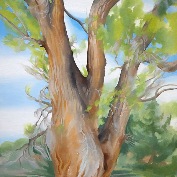
GEORGIA O'KEEFFE
_tn37743.jpg "JOAN MIRO-Tête de femme (déesse)")
琼·米罗

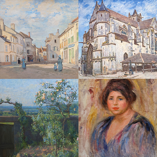
阿尔弗雷德·西斯利

威廉·德库宁
_tn43950.jpg "WINSLOW HOMER-In the Wheatfield (Girl Standing in a Wheat Field)")
温斯洛荷马

韦恩·蒂博

格哈德·里希特

托姆·韦塞尔曼

塞恩·斯卡利

托姆·韦塞尔曼
